Designing for Joy
It's 10am and I am on my second cup of coffee... I can already see it is going to be one of those days. I have not been writing because I have been on vacation and then after returning a month ago I have not been writing because I have been trying to catch up with client work as well as manage a stream of new clients and projects. It has been intense but I think I am getting back to some sort of a rhythm.
In recent times I have become infatuated with animations in web applications. A while ago I wrote that web design is currently in a state where we are good at displaying information and getting people to interact with it and get things done but we are still ways away from creating experiences on the web the way video game developers create experiences. In my quest to design better interfaces I realized that animations, in general, is a good way to evoke emotion within a user of your product. It makes all the difference in a web application. Turning the jerky transitions of moving between pages on a website to an animation or updating elements on a page using an animation makes the website feel faster, smoother, more responsive and friendlier if the right animations are sprinkled in the right areas. Learning this I have recently started studying the most basic of animations and experimenting with all sorts of javascript to create better experiences.
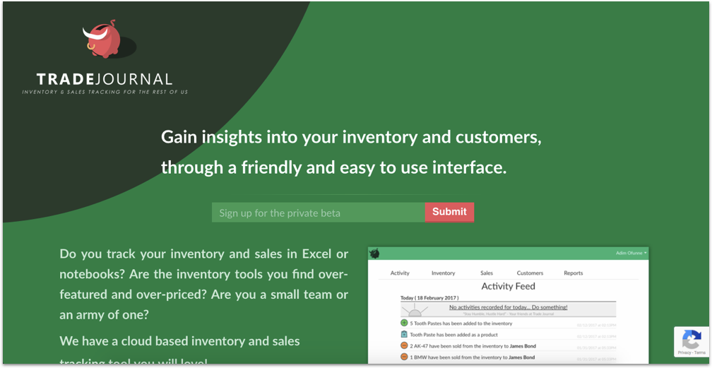
I have been working on an Inventory management application called Trade Journal. While the development is progressing I put up a splash page, my intention is to capture the contact information of those interested in the application before it is ready so I can get a handful of users from day one. So I designed this page.

This project is an experiment of sorts, on one hand, I am using all technology I am very familiar with (Ruby on Rails and Javascript) but at the same time I am testing out new ideas I have on design, animation and feature constraints and see how it all turns out in the end. That being said I wanted to show the character of the Brand/Application right on the splash page, so that prospective users can already tell if the application is for them or not. I am a big fan of applications like Slack, Mailchimp and Basecamp. Applications that take VERY boring enterprise things like talking to coworkers about work, sending out newsletters and project management and give them a goofy playful feel to it. They make work not feel like work, they encompass a belief of mine that is if everyone enjoyed what they did for work, the world would be a happier and more productive place. Work does not have to be serious it just has to be productive. Trade Journal is going to be an application with funny quotes, emojis and animations all working together to achieve this belief.

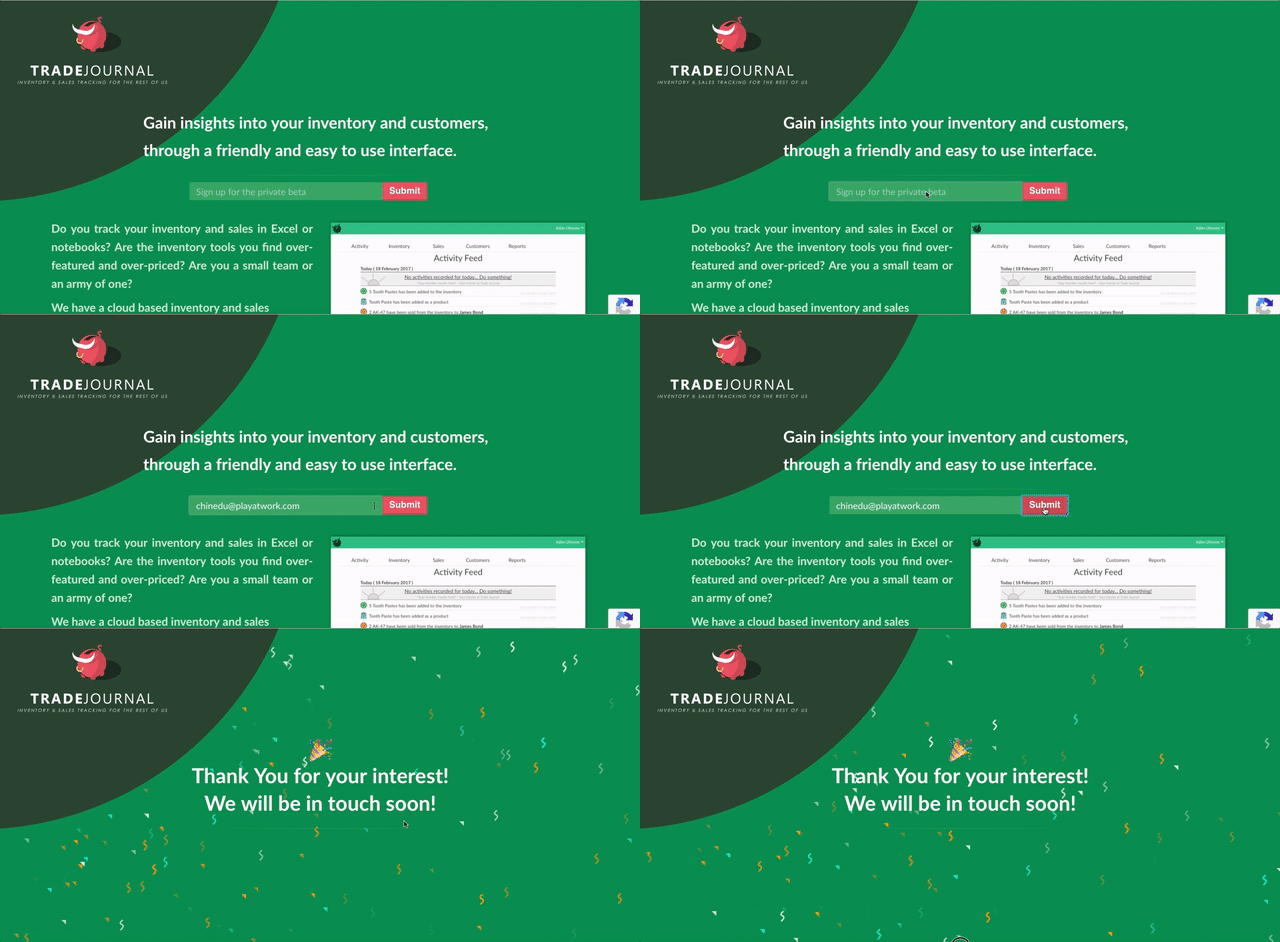
In that vein, I created the Trade Journal page to animate a confetti drop whenever someone signs up.I tested it with a couple of friends while talking to them on the phone and I either heard them gasp or exclaim "ooooooooooh nice!". It was fun hearing their reactions to the surprise, which immediately validated to me that I am going down the right path for creating an application that is an experience and not just a boring data entry tool. That's my goal with Trade Journal, to make something that has some character and hopefully put some joy into someone's otherwise boring day.
Subscribe to The Art of Coding
Get the latest posts delivered right to your inbox