Spotgetter: An app I wish I made
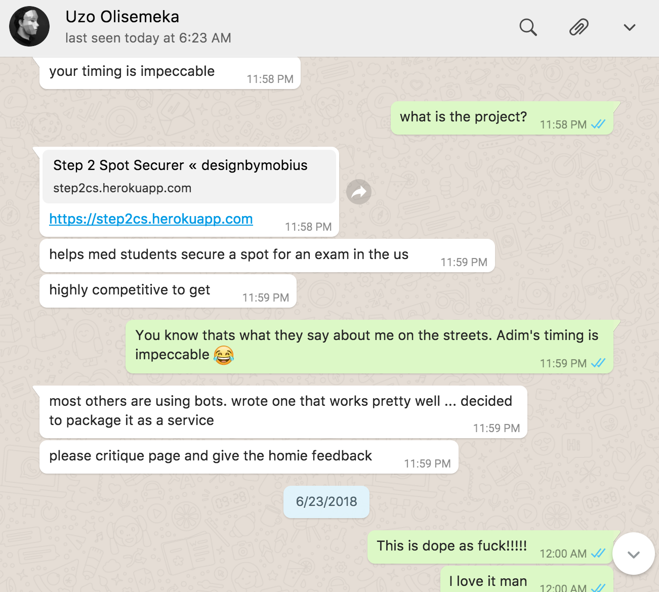
A couple weeks ago I tweeted that I was back to blogging, a couple minutes later I got a Whatsapp message from Uzo saying he was glad to see me back writing but coincidentally he was just deploying a web-application he has been working on and wanted me to give some feedback. He shot me a link to Spotgetter. As I scanned the site, it was love at first site... I mean sight 😍.

He explained that med students had this exam called Step 2 CS and in the US there were limited exam centers across the country and hence the exam spots for dates are highly sought after. The issue is that there are bots out there targeting these spots and hoarding them, which even makes the matter worse, no one can get the good spots. After building a script to help his sister secure a good spot, he decided to productize the script.... hence Spotgetter.
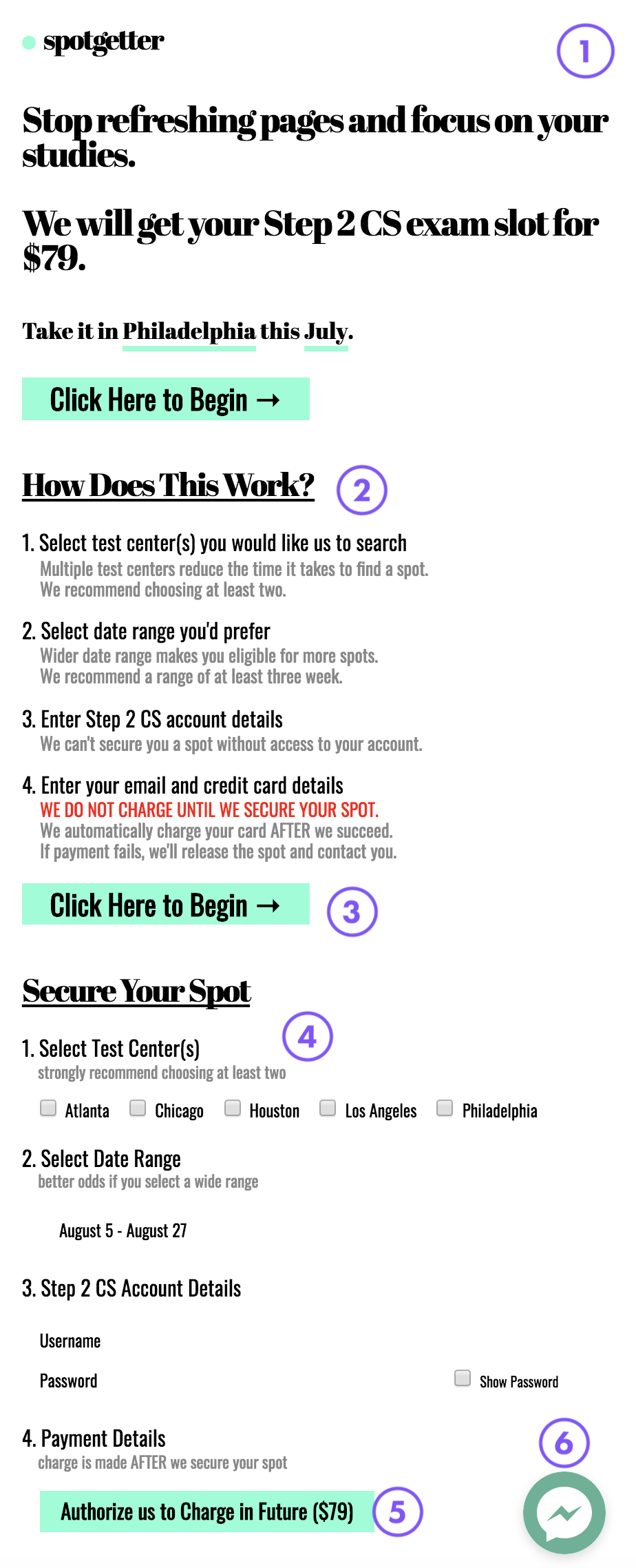
What makes this story cooler is that he basically released this in the middle of the night (Clearly Uzo does not read my blog) and then the very next day he got two paying customers and the day after that he got two more paying customers and so on. It is exactly a month since he launched and he has generated enough money that he could buy himself a cup of coffee in Canada every day for two years and still have change left. The app is just not surviving... it is thriving. Someone once told me, "You know something is good when you look at it and wish it was you that created it" and that is the case here. To explain to you why I am a fan of Spotgetter I will have to show you the web page and break it down.

- The Design: This is the culmination of years of experience. At first glance it looks like nothing, it is a perfect case study for an MVP app. It looks like it can be built in just a few hours but you will be mistaken. Days, if not weeks of work has gone into refining the back-end of this application while its exterior looks deceptively "simple". In this application he is not showing any visual skills or CSS ninja shit, its almost as plain as craigslist, but that is also the beauty of it. An app like this is here to sell a solution, to soothe a pain point, and when people are in pain they don't care about the animations and graphics on your website, they just want to know if you can solve the issue they have and you can see Uzo understands this from the very first sentence you read on the website. The line after that immediately tells you how much it will cost. very clear, nothing shady! This seems like a no brainer but very few websites are as clear as this. The pain they solve and how much it costs to solve it.
- How it works: This is key because when you are taking people's money people want to know what exactly they are paying for and what to expect. When looking for solutions you do not want surprises. The tips in this section hints that he wants you to win and the fact that he does not take a payment until you win shows a proper alignment between his service and its customers. It is worth the risk for them to try it.
- Multiple Calls to a single action : This is very underrated, there is no confusion about what Uzo wants you to do on this page. There is no confusion on what to click next.
- Form on the same page: For a developer, it would be tempting to make this form a popup or on a different page to "separate concerns" but keeping shit simple works perfectly here and probably converts better.
- Clear pricing: Again he reinforces how payment works and gives one clear option. I recently turned down to use Google's Firebase because they had an opaque pricing system a couple months ago. Now it has been fixed. The clearer the pricing the better, cause no one wants a $100 surprise bill.
- Chat: To me, this was the kicker, I have always been a hater of chat on websites, but I have been won over, the amount of conversion from prospective sales to actual sales Uzo has had just by exchanging a few sentences with prospective customers has been unbelievable. This is something I definitely would not have done if I was tasked with the same application and I would definitely have lost significant sales for it.
I really like this application because it is easy to see how it could easily be over-engineered if given to the wrong person to execute, but Uzo's solution, which has been very successful is a mixture of understanding the pain point of his customers with a fuck it ship it mentality, which gives birth to a winning product.
There are some things I think he can do to further improve conversion, such as publishing testimonials of happy clients or get written about on Lifehacker, which he can link to from his website, these both signal the legitimacy of Spotgetter to someone who stumbles onto it, but what do I know, he is the one with the successful execution 😁.
Subscribe to The Art of Coding
Get the latest posts delivered right to your inbox